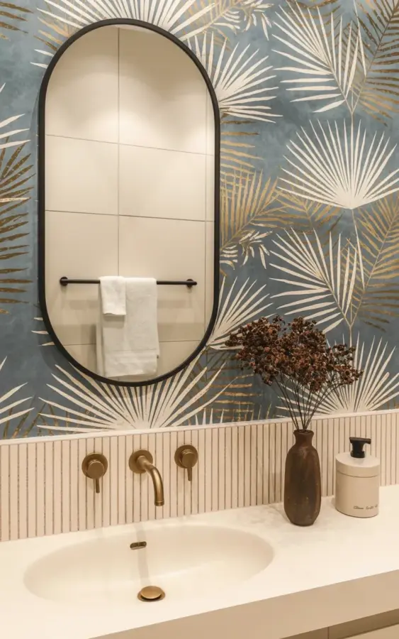
If you’re thinking about adding bathroom wallpaper with a bold botanical print, you’ve probably seen those dreamy Pinterest photos. But here’s the thing: a lot of people mess it up by going overboard. I’ve seen it happen. You fall in love with a huge palm frond pattern, slap it on all four walls, and suddenly your bathroom feels like a jungle that swallowed a washbasin. Not great. The bathroom wallpaper mistake to avoid is forgetting to balance it with simple elements. Take this modern bathroom. The wallpaper has large white fronds on a dusty blue-gray background with subtle gold accents – gorgeous, but it’s tempered by white slatted paneling on the lower half and a clean oval sink. That contrast is everything.
Step 1: Anchor Your Pattern with a Solid Neutral Base
Bold botanical wallpaper is a statement. It wants attention. But if every surface screams, nothing gets heard. So before you even buy a roll, decide where you’ll put a visual anchor. In the photo, the bottom half of the wall uses vertical white wooden slats. That’s the anchor. It grounds the fronds and keeps the room from feeling top-heavy.
You don’t have to replicate slats exactly. A white wainscot, a beadboard, or even a simple painted chair rail can work. The key is to create a clear horizontal line that separates the pattern from the rest of the room. Honestly, I once painted a bathroom coral pink and then realized I had to look at it every morning while brushing my teeth. Never again. I learned that your eyes need a resting spot. That’s what the neutral base provides.
Step 2: Use Wainscoting or Slatted Paneling to Create a Visual Pause
Look at the photo again. See how the wall is split? Upper half with the botanical wallpaper, lower half with slats. That’s not an accident. It’s a deliberate trick to break up a large pattern. Your brain processes the fronds as a single element, then your gaze drops to the clean lines of the slats. A natural pause.
I’m a fan of slats because they add texture without noise. But beadboard works too, and so does a simple painted wainscot in white or a soft neutral. You want something that doesn’t fight the wallpaper. Remember: the pattern is the star. The paneling is the supporting actor. And supporting actors don’t steal scenes. They make the star look better. So choose a finish that’s matte, plain, and a shade lighter than the wallpaper’s background if you can.
Step 3: Pick Fixtures That Whisper, Not Shout
Now let’s talk about the sink, the faucets, and the mirror. This is where most people go wrong. They see a wild wallpaper and think they need equally wild fixtures. Wrong approach. In the photo, the sink is a clean white oval mounted on the wall. Simple. Minimalist. It doesn’t try to compete with the fronds.
- Stick to neutral colors for large fixtures. White, off-white, or light gray sinks and toilets. Let the wallpaper do the color work.
- Faucets can add contrast, not chaos. Here they used three wall-mounted bronze faucets. Bronze has warmth but it’s muted. It echoes the gold accents in the wallpaper without being identical. Good move.
- Avoid chrome if your wallpaper has warm tones. Chrome is cold. If your pattern has gold or brass, go with a brushed brass or oil-rubbed bronze. Small nuance, huge difference.
Ok, so that’s the formula: neutral base, warm metal accent, clean lines. Follow it and your bathroom won’t look like a floral explosion.
Step 4: Choose a Mirror That Complements Without Competing
Mirrors are tricky. They reflect light and pattern, which can either double the visual load or break it up nicely. The mirror in the photo is a large oval with a black frame. Why black? Because it sits against the wallpaper without blending in. It creates a defined shape. And it’s simple. No ornate carvings, no gold swirls. Just a clean black oval.
Here’s the thing: if you hang a heavily framed mirror on a busy wall, you get visual clutter on top of visual clutter. That’s a recipe for a headache. I learned this the hard way when I put a vintage rococo mirror in a room with big floral paper. It looked like a yard sale threw up in there. So keep your mirror shape simple. Round, oval, or even a plain rectangle with a slim frame. And if you want to echo the wallpaper’s metallic tones, you can use a thin brass rim, but keep it subtle. The mirror’s job is to show you your face, not to shout “look at me!”
Step 5: Limit Accents to One or Two Simple Notes
Once you have the wallpaper, the paneling, the sink, and the mirror, you might be tempted to add a ton of accessories. Don’t. In the photo, the only accent piece visible is a brown ceramic vase on the right side of the sink. That’s it. One vase. No stack of candles, no tray of soaps, no plant competing with the botanical print. Just a single earthy element that ties into the warm bronze tones.
So here’s my hard rule: pick one accent. A vase. A small framed print. A textured towel. Not three. Not five. One. And make sure it’s a muted, natural tone. Browns, soft greens, creams. Nothing bright. Nothing shiny. The wallpaper is already busy enough. Give your eyes a vacation from that one little spot.
Step 6: Don’t Forget the Small Hardware – It Adds Up
You might overlook the towel bar and the hooks. Don’t. In the photo, a black towel bar sits under the mirror with a white towel hanging on it. Simple, clean, quiet. But imagine if that towel bar were gold and ornate. It would fight the bronze faucets and the gold flecks in the wallpaper. Too many metals. Too competitive.
Choose hardware in the same family as your faucets. If your faucets are bronze, go with bronze towel bars and hooks. If they’re brass, stay with brass. And keep the shape minimal. A straight bar, a simple ring. Nothing with scrollwork or decorative ends. I’ve seen bathrooms where the hardware alone had three different finishes – and the wallpaper was already doing a lot. Just pick one finish and apply it everywhere. Your future self will thank you every time you grab a towel.
So there you have it. Six concrete steps to avoid the classic bathroom wallpaper mistake. Start with a neutral anchor, add a visual pause with paneling, choose quiet fixtures, pick a simple mirror, limit your accents to one piece, and keep hardware consistent. Follow these, and your bold botanical wallpaper will sing instead of scream. Save this for your next project, and when you finally hang that frond pattern – remember the slats, the oval sink, and the single vase. Simple moves. Big payoff.
#bathroomwallpaper #botanicalwallpaper #bathroomdesign #modernbathroom #wallpaperideas
Leave a Comment