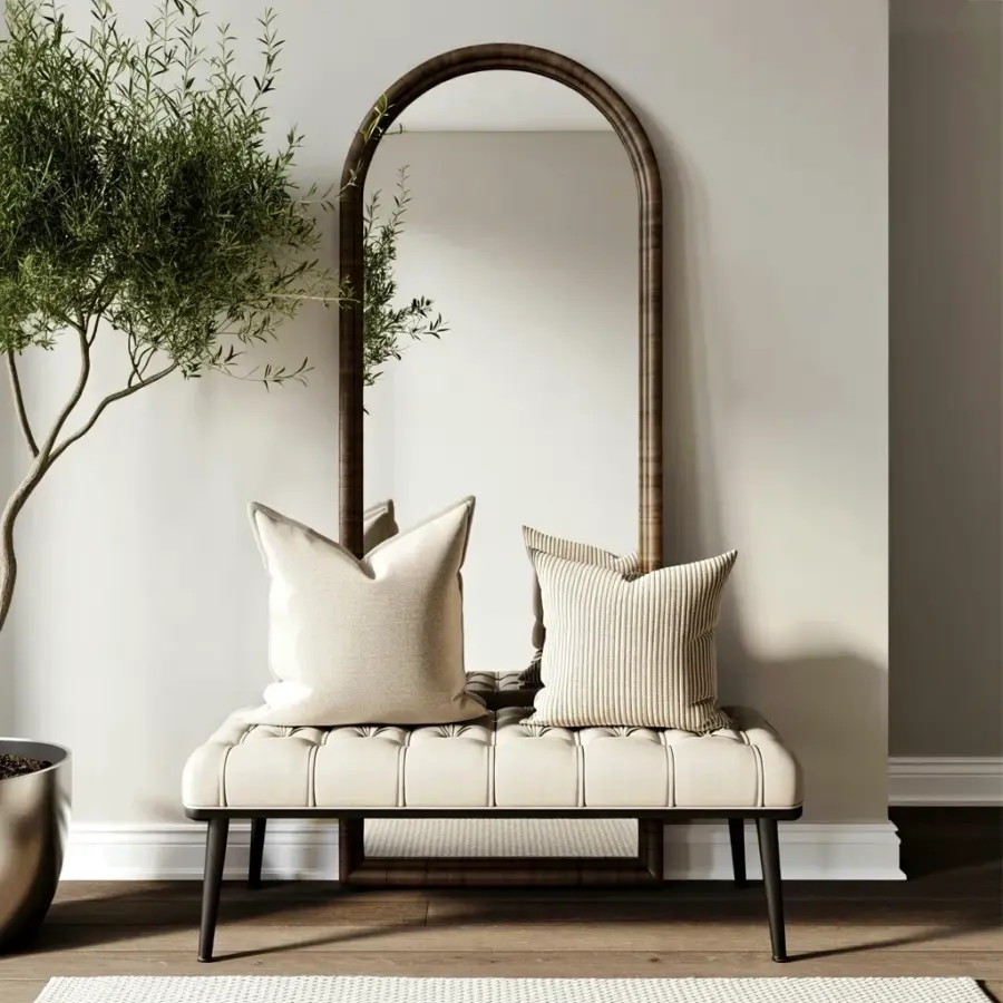
When planning a mid-century modern main door, most people get the silhouette right. They choose a sleek slab, a narrow vertical window, or that iconic asymmetrical panel. But they miss the single most important detail: the color. I have seen countless front doors that look perfect in a catalog but feel completely wrong once installed. The problem is almost always the paint. If you want a truly authentic retro entryway, you have to stop thinking about shape first and start thinking about the color palette. A midcenturymoderndoor needs the right hue to tie the whole facade together.
Why the Wrong Color Ruins a Midcentury Modern Door
A midcentury modern door is not just a piece of wood. It is a statement. When you pick a bright orange or a neon teal, it does not automatically make your home look retro. It can actually look like a theme park or a costume. I have seen homeowners choose a bold orange door for a brown ranch house, and the result was jarring. The eye jumps to the door instead of enjoying the whole composition.
The mistake comes from looking at isolated inspiration photos. You see a glossy orange door on a white stucco house in Palm Springs and you think it will work on your brick ranch. But the surrounding colors matter more than you think. A true midcenturymoderndoor should feel like it belongs, not like it is shouting.
How to Choose a Vintage Hue for Your Front Door
Start by looking at the fixed colors of your home. Your roof, your siding, your brick, your landscaping. Those are permanent. The door is the variable. You want a vintage hue that complements, not competes. Think of colors that were actually used in the 1950s and 1960s. Not just any bright color, but the specific muted shades that architects specified.
- Warm wood tones like walnut, teak, and mahogany.
- Muted greens like sage or olive.
- Subtle mustard yellows that lean brown, not neon.
- Dusty blues that are almost gray.
- Charcoal and black for a more modern midcentury look.
These colors feel grounded. They let the clean lines of the door do the work. If you are tempted by a bright red or a hot pink, step back. Ask yourself if that color appears anywhere else in your neighborhood or in period photographs. If the answer is no, it is probably not the right choice for a modern entryway.
The Best Warm Wood Tones for a Retro Entryway
Warm wood tones are the safest and most authentic choice for a retro entryway. Many midcentury modern homes used natural wood doors with a clear finish. That rich honey oak or dark walnut grain adds texture and warmth that paint cannot replicate. If your home has brick or stone, wood ties those materials together naturally.
You do not have to use solid wood. A good quality veneer door with a real wood face works beautifully. Just make sure the grain is straight and consistent. Avoid staining it too dark, because a blackish brown can look heavy. Aim for a tone that sits between caramel and espresso. That range was ubiquitous in the 1950s and 1960s. A warm wood midcenturymoderndoor feels intentional and timeless.
Muted Vintage Hues That Work With Brick or Siding
If you prefer paint over wood, stick with muted vintage hues. These are colors that have a touch of gray or brown in them. They are soft and easy on the eyes. For a brick home, try a sage green or a dusty blue. For a house with wood siding, consider a warm cream or a muted mustard. These hues do not fight with the brick tones or the wood grain.
I have a friend who painted her midcenturymoderndoor a color called “cactus flower.” It was actually a soft olive with a hint of yellow. Against her white stucco and natural stone walkway, it looked perfect. The same color on a house with red brick would have looked muddy. Always test your paint on a large board and hold it against your exterior in different light. The afternoon sun can change a color completely.
Common Color Clashes to Avoid on Your Midcentury Home
One of the biggest color clashes is bright teal against warm red brick. The blue-green fights the orange undertones in the brick, and the result is a visual mess. Another common clash is bright orange against a house with yellow-toned siding. The two warm colors compete, and neither looks good. You want harmony, not a battle.
Also avoid glossy finishes on bold colors. A high gloss teal door looks like a toy. A satin or matte finish makes the same color look sophisticated. If you choose a dark color like charcoal or deep brown, a slightly glossy finish can add depth, but keep it subtle. The goal is a modern entryway that feels calm and collected, not loud and distracting.
A Step by Step Guide to Painting or Refinishing Your Door
First, remove the door and all hardware. Sand the surface lightly to remove old finish. Wipe it clean with a tack cloth. Apply a primer that is compatible with your top coat. For wood doors, use an oil-based primer to prevent bleed-through. For metal doors, use a rust-inhibiting primer.
Second, apply two thin coats of your chosen vintage hue. Let each coat dry fully before sanding lightly with fine grit paper. The finish should be smooth to the touch. Third, reinstall the door and add new hardware in a brushed brass or satin nickel. Those metals were common in the midcentury period. Avoid bright polished chrome or black iron unless your home is explicitly industrial.
Finally, step back and look at the door from the street, not just from the doorstep. The view from the curb is what matters. If the color feels too strong, add a neutral tone to the door frame or trim to pull it back. A white or warm gray frame can make a muted door pop without being overwhelming.
Matching Your Door to Your Landscaping and Architecture
Your front door is part of a larger picture. Look at the plants around your entrance. If you have a lot of green foliage, a warm wood door will blend nicely without disappearing. If you have desert landscaping with gravel and succulents, a muted clay or terra cotta hue can echo the soil. The best modern entryway designs consider the door as one element in an outdoor room.
Also think about the architectural style. A flat roof and clean lines call for a simpler door with a bold but restrained color. A home with a pitched roof and horizontal siding can handle a slightly brighter accent, like a muted mustard or a dusty turquoise. But always keep the saturation low. A true midcenturymoderndoor does not scream. It speaks clearly, once.
Choosing the right color for your midcentury modern main door is not complicated. Ignore the flashy Pinterest boards that show every color under the sun. Focus on warm wood tones or muted vintage hues that feel authentic to the period. Test your colors in real light. Look at the whole facade, not just the door. When you get it right, your entryway will feel like it has always been there.
If you are still unsure, take a photo of your house and pull the color sample into a photo editor. Then you can see how it reads before you buy a single can of paint. Save this guide for your front door inspiration and start planning your retro entryway with confidence.
#midcenturymoderndoor #frontdoorideas #entrywaydesign #retrohomedecor #modernentryway
Leave a Comment