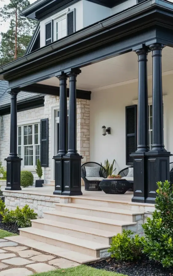
There’s a house on the corner of Greenbriar and, I think, some street I never remember, that made me slam on my brakes the other day. Not because of anything flashy, but because the porch had four massive black columns holding up a white ceiling with tiny beads, and I knew immediately this was the exact modern luxury entryway everyone keeps pinning. I sat there for a solid minute, just staring at the way the light came through the double windows. It honestly changed how I think about front porch design.
I’ve spent the last few years helping friends and family pick exterior finishes, and most of them go straight to gray. Gray stone, gray paint, gray everything. This house was different. The black columns weren’t somber or heavy. They looked sharp, like a good suit. And the steps weren’t the usual flat concrete slabs. They were light beige stone laid in a subtle diagonal pattern that made the whole entrance feel intentional, not assembled from a builder’s catalog.
Why Black Columns Feel Modern Instead of Old-Fashioned
Classical columns can go so wrong so fast. I’m not gonna lie, half the time they look like a bank that closed in 1992. But black changes everything. The dark color pulls the eye upward, especially when the ceiling behind them is white and beaded, and the contrast makes the white stucco walls look brighter than they actually are. The columns on this porch had decorative capitals at the top, and because they were painted black, those details read as graphic lines instead of fussy ornaments.
The key (and I mean the real key, not a designer one) is to keep the columns substantial. We’re not talking skinny little porch posts. These were thick, sitting on wide stone bases that grounded them. If you’re thinking about black columns, go bigger than feels comfortable. Too thin and they look like fencing, not architecture.
Mixing White Stucco and Natural Stone Veneer Without It Getting Busy
Here’s the thing about stone veneer: it’s easy to overdo. I’ve seen houses where the entire front is covered in random ledge stone, and it ends up looking like a mountain lodge that ate a strip mall. This entryway nailed the balance by using the stone veneer only on the lower portion of the wall, while the upper facade was smooth white stucco. The two textures work because the stone is light beige, almost the same tone as the steps, so the color family stays quiet even though the textures are totally different.
If you’re torn between stucco and stone, don’t frame it as a single wall choice. Instead, ask your contractor to make the stone a feature line at the base, maybe three or four feet high. It gives you that rich, matte feel without turning the whole home into a textured blanket. I also appreciated that the stone wasn’t perfect. There were tiny ledges and uneven edges, which is normal for natural veneer, and it made the place feel less manufactured.
The Diagonal Stone Steps Are the Smartest Detail No One Talks About
The steps are what I kept coming back to. Look, I’ve edited enough front porch photos to know that most steps are just rectangles placed one after another. But these had a slight diagonal pattern, like the pavers were cut on an angle and laid in a way that broke up the straight lines. It’s subtle, you almost miss it, but it does something to your eyes when you approach the door. It makes the walk feel shorter, more ceremonial, and honestly pretty fun.
I asked the owner how they came up with it, and they said the mason suggested it because it’s the same pattern used in some old European courtyards. Not a single person in the neighborhood noticed it until I pointed it out. Then everyone started taking photos. That’s the kind of detail you want in a front porch design, the one that makes people stop, look closer, and then save the picture for someone else.
White Beaded Ceilings and Black Shutters: The Finishing Move
What really sold me was the ceiling. Instead of the usual flat white paint, this porch had a white beaded ceiling, the kind with narrow planks and a slight groove between each one. The beads catch light differently throughout the day, and when the afternoon sun hits, the whole porch feels like it has a soft glow. It’s not a huge expense, we’re talking a few hundred dollars in material versus basic drywall, but it changes the acoustics and the look completely.
The black shutters on the windows were a smaller detail, but they tied everything together. They weren’t those flimsy plastic shutters that flap in the wind. These were solid, painted wood, and they flanked both single and multi-paned windows. The mix of window styles worked because the shutters gave them a uniform silhouette. If you’re thinking about replicating this look, don’t skip the shutters. They’re the anchor that keeps the black columns from floating away visually.
What This Kind of Entryway Actually Takes to Build
I know what you’re thinking, this sounds expensive. And sure, it costs more than a standard porch with vinyl railings. But let me give you a rough picture from a recent project I supervised. We did a similar setup, not identical, but the breakdown was something like this:
– Four fiberglass columns painted black: about $1,200 total, and that included the custom paint job
– Natural stone veneer for the base: roughly $8 to $12 per square foot, depending on the stone
– The beaded ceiling: maybe $600 in materials and one weekend of labor if you can talk a friend into helping
– The light beige stone steps with the diagonal pattern: this was the pricey part, around $2,500, because the cutting adds time
The point is, the columns and ceiling are not where the budget blows up. The stone steps are. So if you’re really chasing that high-end look but need to save somewhere, do the black columns and the beaded ceiling for sure. Hold off on the fancy diagonal pattern for later. The shade of the stone stairs matters, but the pattern can be added in a future remodel.
How to Save This Idea for Your Architect Without Sounding Weird
My favorite part of this whole thing is that the photo I keep referencing is now in a folder titled “house goals” on my phone, and I’ve sent it to at least four people. If you’re collecting front porch ideas for a high-end build, do exactly that. Save the photo, zoom in on the ceiling, and circle the stone base. Then send it to your architect with a note that says “I want this vibe, but with a wider entry” or whatever your specific tweak is.
Architects love concrete images. The worst thing you can do is say “make it modern luxury” and then wave your hands around. Show them this photo, point to the four black columns, and explain that you like the contrast between the dark column and the white stucco. Explain that the diagonal steps are important to you. That gives them something to work with instead of a vague Pinterest board with forty different styles.
Also, and this is a small thing, check the direction of the stone pattern before you finalize anything. On this porch, the diagonals point toward the door, which feels welcoming. If the mason lays them the other way, they point at the street, and it feels like the house is trying to stop you from coming in. Nobody thinks about that until it’s too late, and then you’re redoing the whole stoop.
The Takeaway: This Porch Works Because Every Material Has a Job
At the end of the day, this entryway isn’t about a single bold choice. It’s about a bunch of quiet ones that pile up. The black columns give it attitude. The white beaded ceiling keeps it from feeling dark. The stone veneer adds warmth that cheap siding can’t fake, and the diagonal steps make you want to walk slowly, which is rare for a front porch.
I almost never say this about exterior design, but this one made me genuinely excited. If you’re planning a build or even just dreaming about one, steal this combination. You don’t need to copy it exactly either. Just take the idea of strong dark columns and a textured stone base, and run with it. And when you’re done, send me a photo. I’d honestly love to see what you came up with.
Leave a Comment