Why Gallery Walls in Small Entryways Usually Feel Off
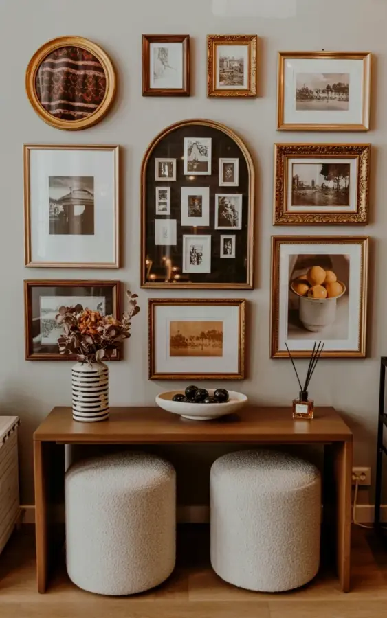
Putting together a small entryway gallery wall can feel tricky. You want it to feel personal, but often the result looks scattered or too cramped. I have seen this mistake over and over: people buy frames that match perfectly, hang them too high, or forget to think about the furniture underneath. The arrangement in the photo above avoids all of that. It uses gold vintage frames, black and white photos, and a sepia still life of oranges in a white bowl. The result feels collected over time, not staged. The dark console table underneath anchors the whole wall. That combination is exactly what makes a small entryway gallery wall work. So, let us walk through the common mistakes so you can build your own without the frustration.
Hanging Art Too High Above a Console Table
One of the biggest mistakes I see in entryway decor is hanging art too close to the ceiling. People think a gallery wall should be centered on the wall itself. In a small space, that just makes the wall feel top-heavy. Instead, treat the art and the furniture as one unit. In the photo, the wooden console table with a dark brown finish sits directly beneath the frames. The lowest frames hover about four to six inches above the tabletop. That creates a visual connection. If you hang too high, your eye bounces between the table and the art, and the whole entryway feels disconnected.
Using Identical Frames and Ignoring Vintage Character
Uniform grids have their place, but not in a small entryway gallery wall. When every frame is the same size and color, the wall looks like a showroom display, not a personal collection. The mistake is thinking consistency equals safety. In reality, a mix of shapes and finishes feels more intentional. Look at the arrangement above: a central arched gold-framed collage of black and white photographs, flanked by vintage landscape prints in gold frames. A circular gold-framed patterned fabric piece sits at the top left. That variety keeps the eye moving. If you are new to mixing frames, start with a unifying element. Here, gold tones tie everything together even though the shapes differ. You can do the same with vintage frames from thrift stores or flea markets. Paint them all the same warm metallic finish if needed.
Forgetting to Anchor the Wall with a Piece of Furniture
A gallery wall floating in the middle of a small entryway feels incomplete. Without something underneath, the art looks like it is hovering. The dark console table in the photo is not just decoration. It grounds the entire arrangement. Your eye rests on it after scanning the frames. The mistake is choosing a table that is too narrow or too light in color. A sturdy wooden piece with a dark brown finish works because it contrasts with the wall and echoes the warmth of the gold frames. If your entryway is very tight, a slim console or even a small bench can serve the same purpose. Just make sure it is wider than the gallery wall so it visually supports it.
Ignoring the Power of a Central Focal Point
When you throw frames up randomly, the wall feels chaotic. The most common mistake is not picking a hero piece. In the arrangement described, the central arched gold-framed collage acts as the anchor. Everything else radiates from it. That gives the eye a clear place to start. Without a focal point, the gallery wall becomes a jumble. So how do you choose yours? It could be a larger vintage portrait, a circular mirror, or in this case a collage of black and white photos inside an arched frame. Build outward from that one piece. Place it slightly off-center if you prefer asymmetry, but keep it as the strongest visual weight.
Neglecting Color Harmony in a Small Entryway Gallery Wall
Another slip is throwing in bright, cool colors that clash with warm tones. The mistake is not looking at the overall palette of your entryway. In the photo, the wall uses black and white photographs, sepia still life, and a patterned fabric piece. There are no jarring blues or neon accents. The gold frames and the dark console table keep everything cozy. If your entryway has warm lighting or wooden floors, stick to art with black, white, cream, and sepia tones. Even a subtle still life of oranges in a white bowl, like the one in the arrangement, adds a touch of life without breaking the mood. Create a small homedecor palette before you start hanging, and pull art that fits that range.
- Stick to a warm metallic frame finish (gold, brass, or bronze) for a collected look.
- Mix photo sizes but keep the color story unified (black and white, sepia, or muted earth tones).
- Include one unexpected shape like a circle or arch to break up rectangles.
- Use the console table to layer a small lamp, a dish for keys, or a tiny plant.
- Measure the total width of your gallery wall so it does not exceed the furniture below.
Overcrowding the Wall with Too Many Small Frames
Small entryways have limited wall space. Filling every inch with tiny frames makes the area feel cluttered instead of curated. The mistake is thinking more equals better. In the photo, there are roughly five to seven distinct pieces, not twenty. That leaves breathing room. Each frame can be appreciated. A good rule is to leave at least two to three inches between frames. If you have a dark console table, the negative space around the art helps the wall feel intentional. Start with three to five pieces and then add slowly. You can always expand later, but you cannot un-cram a wall that already looks busy.
Skipping the Step of Laying It Out on the Floor First
This step sounds simple, but most people skip it. They start hammering nails based on a mental image, then end up with lopsided spacing. The mistake is impatience. Before you touch the wall, lay your frames and art on the floor in front of the console table. Move them around until the arrangement feels balanced. Mimic the composition from the photo: a central arched piece, a circular element at the top left, and two landscape prints on the sides. Tape paper shapes to the wall if you want to be extra careful. That way you avoid unnecessary holes. I always tell people that ten minutes of floor arrangement saves an hour of patching drywall later.
Conclusion
A small entryway gallery wall does not have to be intimidating. Avoiding these common mistakes can turn a frustrating project into one of your favorite home decor successes. Start with a strong focal piece, mix vintage frames in warm golds, and let a dark console table anchor everything. Use black and white or sepia art to keep the look cohesive. Once you see how the arrangement ties together, your entryway will feel welcoming and personal. Next time you walk through that door, take a moment to enjoy the small wall you made your own. Have you tried building a gallery wall in a tight space? I would love to hear what worked for you.
#smallentryway #gallerywall #entrywaydecor #homedecor #vintageframes
Leave a Comment